
The craft today
How to prepare your artwork so it can be printed
This is the page that saves half a dozen emails per job. It is not a design manual: it is what we need to know about your file before we make any screen, why we ask for it, and what happens when it is not there.
8 min read
01
The file is not the design
The design is the idea. The file is the material we work with, and they are two different things. An excellent design inside a badly prepared file makes a bad print, and that cannot be fixed at the press: once the screen is exposed, whatever was in the file is now in the mesh.
That is why we ask for what we ask for. It is not red tape or fussiness: every requirement on this page matches something physical that happens in the workshop, and in the last section we tie each one to the moment it happens.
If you have a designer, just send them this page. If you made the design yourself, you do not need to understand all of it either: send us what you have and we will tell you what is missing. What we want to avoid is the other situation, finding out late.
02
Vector or bitmap: the difference that decides everything
A vector file does not store an image, it stores instructions: this curve, this weight, this colour. That is why it can be the size of a stamp or the size of a wall and the edge is always clean. Those are PDF, AI, EPS and SVG, as long as there are real curves inside and not a photo pasted in.
A bitmap is a grid of pixels, each with one colour. PNG, JPG and PSD. It holds exactly the information it holds and not a scrap more: if you enlarge it, what the software does is invent the missing pixels.
The practical rule: if the design is a logo, lettering or flat shapes, we want it as vector. If it is an illustration or a photograph, we want it as a bitmap, but large and sharp from the start. What never works is a vector logo somebody exported small and then blew up.
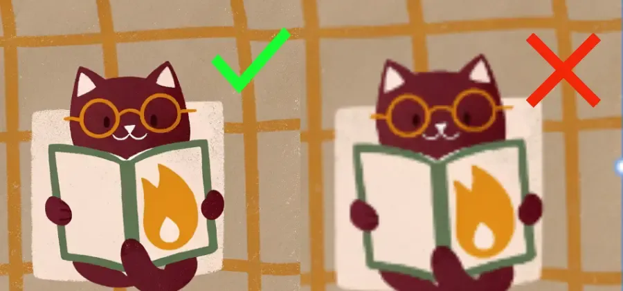
The image below shows both situations with the same drawing. On the left, the original as it came out. On the right, the same one after being enlarged. On a phone screen the difference looks minor.
03
300 ppi, but at final size
We ask for 300 pixels per inch. The part people skip is the second half of the sentence: at the size it will be printed, not the size the file happens to be saved at.
The maths is simple. Divide the width in pixels by 300 and you get the inches it covers; multiply by 2.54 for centimetres. A 1,024-pixel image covers about 8.7 centimetres: a chest logo the size of a glass. A thirty-centimetre back print would need around 3,500.
With vector this conversation does not exist, which is why we push it so hard. A curve has no pixels: it just gets bigger.
If what you have does not reach, it is not a disaster, and above all do not enlarge it: send us the small original. We redraw the key elements as vector and size stops being a problem for good. An already-enlarged file gives us less room, not more.
04
Everything becomes a halftone
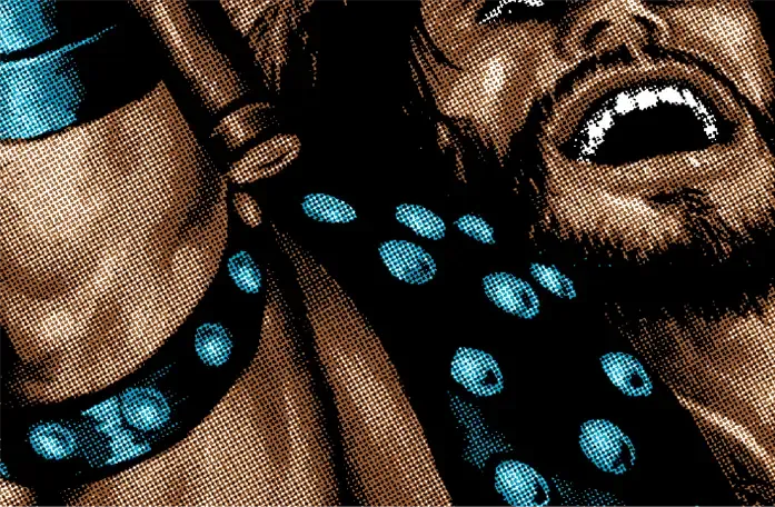
A screen can only do two things: let ink through or not. There is no half tone. So anything that is not a flat area has to be turned into dots of varying size, which from a distance the eye blends and reads as a grey or a gradient. That is the halftone, and it is what you can see on this article's cover.
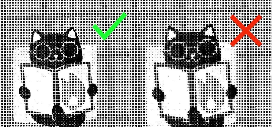
This is where everything above gets paid for, in full. These are the same two drawings from the previous section, converted to halftone exactly as they would go to the screen.
On the left the cat is still a cat. On the right it has turned into a blot: the glasses have merged with the eyes, the flame on the book has vanished and the outline has eaten the background. It is not that we chose the wrong halftone; it is that where the original had a soft edge, the halftone has nothing to hold on to.
There is one practical conclusion: what does not look clean in the file will not look clean printed, and going through the halftone always makes it worse, never better.
05
Every colour is a screen
In screen printing each ink has its own film, its own screen, its own registration and its own pull. We do up to six per position. Each one adds work, adds time and adds cost, so the number of colours is not an aesthetic decision: it is the decision that moves the quote most.
That is why the ideal design for screen printing has few colours and flat ones. If your file has a red that is really fourteen slightly different reds because it came from a photo, somebody has to unify them, and better you than us, because you know which one you meant.
On dark garments there is one more ink you had not counted: the white base. Every colour that has to read on black needs white underneath, or it goes dull. It is not always needed for every ink, but budget for it.
And tell us your colours by name if you have them: Pantone if you know it, and if not, send us a reference of what you want. A red on your screen and a red on ours are not the same red, and ink has no backlight.
06
Minimum line weight, and type
There is a physical limit below which a line does not survive: around eight tenths of a millimetre. Between the gap in the mesh, the thickness of the emulsion and the way ink spreads on contact with fabric, a thinner line either disappears or fattens until it closes on itself.
That applies to lines, to outlines and to small type. The footer with the sponsors at six point is the classic case: it reads perfectly on a monitor and on the shirt it is a grey smear.
With type there is a second thing: convert it to outlines before sending it, or send us the font. Otherwise our computer will swap it for another typeface and we will not know until it is too late.
And remember how it will be seen. A T-shirt is read from a metre and a half away, moving, often in bad light. Anything that needs attention to be read on screen will never be read at all.
07
Margins, silhouette and where the print goes
Send the design cut out, with a transparent background if it is a PNG, and not inside a rectangle. The white rectangle so many images carry around is not neutral: if we do not remove it, it gets printed, and you end up with a patch on the chest.
Tell us what size you want it and where. We have maximum sizes per position and we will tell you, but the decision is yours, and it changes the result a lot: the same design at 25 or at 30 centimetres wide is not the same design.
Bear in mind that every size shares one screen. What looks right on an XXL can look out of proportion on an S, and we will not run two batches for that unless you ask. If the design is very large, it is worth talking about.
And leave air at the margins. A print that runs into the seam is a problem at the press: the seam adds thickness, the squeegee skips over it and that area comes out dirty. A few centimetres of clearance from seams and the collar save us half a ruined run.
08
What happens to the file when it arrives
This is where all the rules above stop being rules and turn into things that happen, one after another, in this order.
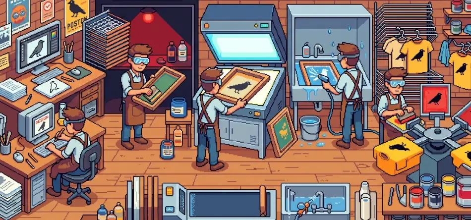
First we separate the file: one image per ink, black on transparent. That is the film positive, and it is exactly what this whole page has been protecting. Then the screen is coated with a light-sensitive emulsion, in the dark, and left to dry.
Then it is exposed: the film on top of the screen, under a strong light. Where the film is black, the emulsion does not harden. The screen is washed out with pressurised water and wherever the design was, the emulsion falls away and the mesh is left open. This is the moment of truth: a line that is too thin falls away completely, and a doubtful edge falls away halfway.
From there it is craft: aligning the registration of each colour, choosing the squeegee, judging the pressure, printing, drying and curing the garment with heat so the ink survives washing. None of that can fix what went in wrong at the start.
09
The checklist before you send it
Vector if it is a logo or lettering; a large, sharp bitmap if it is an illustration. Not enlarged: the small original is better.
300 ppi at the size it will be printed, not the size of the file. Background removed and silhouette cut out. Colours counted and, if you can, named.
Type converted to outlines or the font attached. Nothing below eight tenths of a millimetre. Clearance from seams and collar.
And if you fail half this list, send it anyway. This page is not an entrance exam: it is so you know what we will look at and why we will tell you what we tell you. Adaptation work is quoted separately and we tell you before we start, never after.
Numbers worth keeping
- Resolution
- 300 ppi at the FINAL printed size
- A 1,024 px image
- Covers about 8.7 cm printed
- A 30 cm back print
- Needs around 3,500 px wide
- Vector
- PDF, AI, EPS and SVG with real curves
- Bitmap
- PNG with transparent background, PSD or large JPG
- Inks per position
- Up to 6 in screen printing
- Dark garments
- Add a white base under each colour
- Minimum line weight
- Around 0.8 mm
- Type
- Converted to outlines, or send the font
- Minimum order
- 25 units per design
If in doubt, just send us the file
Looking at a file and saying what can be done with it costs us nothing and saves you weeks. Tell us which garment you want it on, at what size and how many units, and we will tell you whether it works as it is, what needs changing and what each thing costs. If you want a rough figure straight away, the configurator gives you one in four steps.