
History of the craft
Mary Corita Kent: the nun who screen-printed supermarket slogans
She made some eight hundred serigraphs, turned sliced-bread advertising into poetry, taught with ten rules still pinned up in classrooms, and ended up designing a stamp printed seven hundred million times. She did nearly all of it from a school in Los Angeles, with a squeegee in her hand.
7 min read
01
A classroom as a workshop
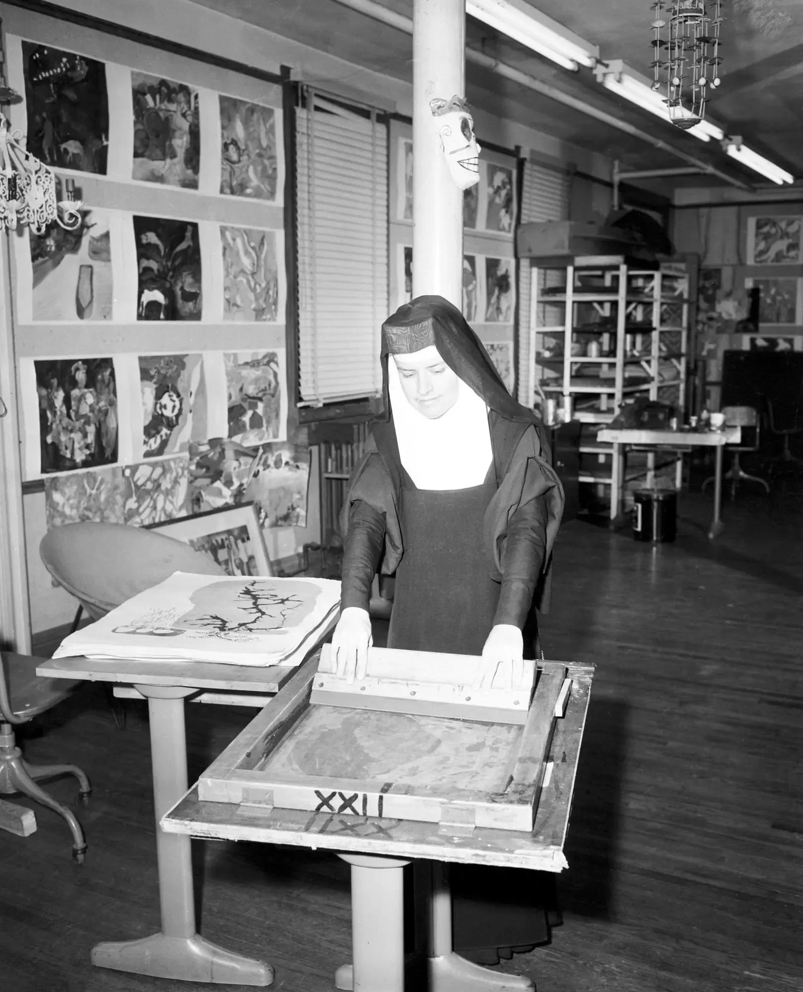
Frances Elizabeth Kent was born in Iowa in 1918 and entered the order of the Immaculate Heart of Mary in 1936, aged eighteen. She became Sister Mary Corita and ended up running the art department of the order's college in Los Angeles.
There she chose screen printing, and the choice was not incidental. It is cheap, it can be done as a group, it needs no printing press and it produces many identical copies. For someone who wanted her images to circulate rather than hang in a gallery, it was the obvious technique. Her prints sold for a few dollars.
The workshop ran like a cheerful factory: students pulling prints side by side, impossible deadlines, annual shows that drew crowds. Corita worked with a device she called the finder, a simple cardboard frame with a hole in the middle that you hold up to your eye to isolate a piece of the world. A sign, a price tag, one letter from an advert. Whatever stayed inside the hole was the raw material.
02
1962: the soup cans change everything
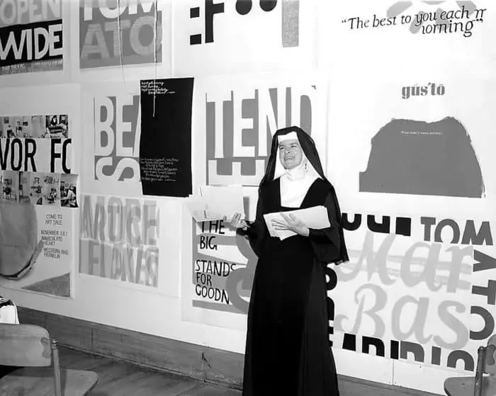
In 1962 Corita visited the Los Angeles show where Andy Warhol was exhibiting his Campbell's soup cans. She came away convinced of one thing: the language of the supermarket was the language everyone read every day, and therefore it was where she had to put what she wanted to say.
From then on her work fills with brands. Wonder bread with its coloured circles, Del Monte tins, a cereal brand's slogan about goodness. But she was not celebrating advertising: she was taking it apart. Next to the slogan she would set a fragment of scripture, a line from Lorca or Camus, a sentence from a civil-rights speech. Commercial typography ended up saying the exact opposite of what it said in the shop.
The sixties did the rest. Her prints filled with Vietnam, with poverty, with civil rights, the colours louder and the words more direct each year.
03
The ten rules
Her art department produced a list of ten rules that has been reproduced around the world, often with no idea where it came from. It says things like: rule four, consider everything an experiment; don't try to create and analyse at the same time; and the only rule is work, because the people who work all the time are the ones who find things.
Rule ten, which closes the list, sets the tone: break all the rules, including these. Part of it is attributed to John Cage, a friend of the department. The list was written for one specific classroom and has ended up pinned to the walls of design studios, print shops and schools everywhere.
They are worth reading with an actual workshop in mind: they describe manual work rather well. Try things, make cheap mistakes, repeat, don't sit staring at the screen waiting for the good idea.
04
The break and the gas tank
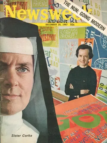
Not everyone liked her work. The archbishop of Los Angeles considered those mixtures of slogan and scripture disrespectful, and the conflict with the hierarchy grew over years. In 1968 Corita left the order and moved to Boston to do nothing but work.
In 1971 she painted what is probably her most-seen piece: a band of colour wrapped around a gas tank at the entrance to Boston, visible from the motorway. It is one of the largest copyrighted artworks in existence, and millions of drivers look at it every year without knowing who made it.
In 1985, a year before her death, she designed the United States Postal Service's Love stamp. Hundreds of millions were printed. Few artworks of the twentieth century have passed through so many hands.
05
Why she matters to us
Because Corita argued for exactly what we like about the craft: that a cheap, repeatable technique is a way of getting an idea to a lot of people. She did it with prints costing a few dollars; we do it with shirts a band sells after a gig. The surface changes, the logic does not.
Because she worked with few colours and hard contrast, which is what screen printing does best. And because her raw material was letters and words rather than complicated illustration: big type, well chosen and well printed, is still the design that works best on clothing.
And because her finder, isolating a piece of the world and looking at it on its own, is what we do every time someone brings us artwork and we have to decide what survives when you only have three inks.
Facts worth remembering
- Real name
- Frances Elizabeth Kent, Iowa, 1918–1986
- Entered the order
- 1936, aged eighteen; became Sister Mary Corita
- Serigraphs
- Around 800 over her lifetime
- The turning point
- Seeing Warhol's soup cans in Los Angeles in 1962
- Brands she used
- Wonder, Del Monte and other supermarket slogans, turned inside out
- The ten rules
- Rule seven says the only rule is work; rule ten says break them all
- Left the order
- 1968, after years of conflict with the Los Angeles hierarchy
- Most-seen work
- The band of colour on Boston's gas tank, 1971
- Love stamp
- Designed in 1985; hundreds of millions were printed
Few inks, many copies
That is the definition of the craft, and it still holds. If you have a message and you want it out on the street, screen printing is still the most direct way to put it there.