
History of the craft
Cuban film posters: when a lack of means invented a language
With no coated paper, no photographs of the stars and barely half a dozen inks, the designers at ICAIC produced one of the most admired poster collections in the world between 1960 and 1980. They did it with screen printing, and not by choice: it was the only technique within reach.
7 min read
01
A film institute with its own screen-printing workshop
In March 1959, months after the revolution, Cuba created ICAIC, its institute of cinematographic art and industry. It was one of the first cultural institutions of the new country, and from day one it was clear that films had to be advertised. The question was how.
Offset needed plates, chemicals and paper that came from abroad, and the United States embargo closed that door very quickly. Screen printing, by contrast, needs almost nothing: a frame, a mesh, emulsion, a squeegee and ink. You can set it up in a room and repair it with whatever is at hand. ICAIC opened its own screen-printing workshop and turned a limitation into a method.
The practical consequence is that those posters were not printed in the thousands but in the hundreds. Each title had a short run, often three to five hundred copies, pulled by hand, sheet by sheet. That is one reason they are collector's items today.
02
The constraint that forced them to think
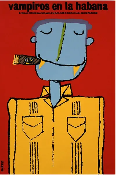
There is a second limitation that proved even more fertile. For foreign films, the workshop received no publicity material from the studios: no photographs of the actors, no logos, no instructions on how the film should be advertised. The designers had only a print of the film and a screening room.
So they watched the film and invented an image. Instead of the lead actor's portrait, a metaphor. Instead of the famous face that sells the ticket, an object, a silhouette, an impossible colour. The poster stopped being an advertisement and became a reading.
Screen printing fitted perfectly. It is a flat-ink technique: every colour is a pull, and every pull costs time and money. If you have to choose four colours, you choose them well. That arithmetic produces the violent contrasts, the cut-out silhouettes and the saturated backgrounds we recognise instantly.
03
The names behind them
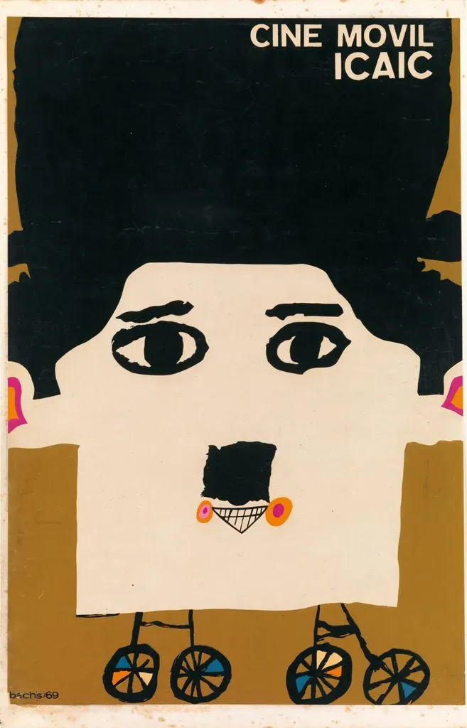
The most prolific was Eduardo Muñoz Bachs, who signed close to two thousand posters in his lifetime. There is a nice irony in the fact that the designer who best defines the Cuban poster was born in Valencia, Spain, in 1937: his family emigrated to Cuba when he was a child, and he was self-taught. His line, almost childlike and always light, is the exact counterpoint to the drama of some of his colleagues.
Alongside him were René Azcuy, with those close-ups in black, white and a single stain of colour; Antonio Fernández Reboiro, the most graphic and geometric; Alfredo Rostgaard, who made the 1967 Canción Protesta poster, a bleeding rose reproduced a thousand times; and Raúl Martínez, who came from painting and pushed pop art towards politics.
They were not working in isolation. On the other side of the world the Polish poster school was doing something similar, and pop and psychedelia were circulating everywhere. But the Cuban result has a voice of its own, and it comes from that mix: almost total graphic freedom, almost no budget.
04
What we take from it, sixty years on
The first lesson is that limiting colours does not impoverish a design; it forces it to be better. When someone brings us an illustration with twenty tones and we reduce it to three well-chosen inks, it almost always gains strength. The Cuban poster is that argument proved at historical scale.
The second is that screen printing is still what it was: cheap to start and expensive to get wrong, giving a dense, opaque colour that no digital print matches. The same thing that allowed posters to be printed in Havana under an embargo allows fifty shirts to be printed today for a band that is just starting.
And the third, perhaps the most useful: those designers had no photo of the star, and ended up making something better than an advertisement. When a client tells us they have no spectacular image to print, that is usually the beginning of a good conversation.
Facts worth remembering
- ICAIC founded
- 1959, months after the revolution
- Why screen printing
- The embargo cut off supplies for offset printing
- Typical run
- 300 to 500 copies per title, pulled by hand
- Posters by Muñoz Bachs
- Close to 2,000, and he was self-taught
- Where he was from
- Born in Valencia, Spain, in 1937; emigrated to Cuba as a child
- Photographs of actors
- None: foreign films came with no studio material
- Where they are now
- In museum collections worldwide, including MoMA
From the poster to the shirt
At the workshop we use the same technique and the same rules: flat inks, few pulls and one clear idea. If your design has too many colours, or no image yet, that is exactly where the jobs we enjoy most begin.