
The craft today
You generated the design with AI: here is what it still needs before it can be printed
Every week we receive files made with an image generator. The idea is usually good and the artwork looks great on a phone. The problem is elsewhere: the file looks finished and it is not. Here is exactly what is wrong with it and what we do at the workshop so that it prints well.
9 min read
01
The gap between an image and a print
A generated image is made to be looked at on a screen: backlit, millions of colours available and no physical limits. A print is ink on cloth: a fixed number of inks, a mesh, a squeegee and a garment that then has to be worn and washed sixty times.
Between the two there is work that nobody sees, and that a designer always used to do before sending us anything. With generators that step has been skipped: the file arrives looking final. It is not, however good the image is.
To be clear: there is nothing wrong with generating images. It is one more tool and people are doing very good things with it. What we are saying is something else, and it is technical: what comes out of a generator is a starting point, not a film.
02
Size: 1,024 pixels is not thirty centimetres
Most generators produce square images around 1,024 pixels a side. For printing we ask for 300 dots per inch at final size, which is what makes an edge look clean rather than stepped. Do the arithmetic: 1,024 divided by 300 is a little over three inches, about 8.7 centimetres.
In other words, a stock generated image is good for a chest badge the size of a glass, not for a full back print. Blown up to thirty centimetres, what reaches the screen is a soft image with blurred edges and fine detail turned into a smudge.
Upscalers help, but they invent: what they add is not information, it is a plausible guess. And if the invented detail is two tenths of a millimetre wide, it will not survive the mesh anyway. So when an image has to go large, what we do is redraw the key elements as vectors. Size then stops being a problem for good.
03
Colours: from thousands down to a handful
A generated image easily contains tens of thousands of distinct colours. There are gradients, there are soft shadows, and there is noise the model adds by itself because it looks more photographic. On a screen you do not notice; in a separation it all comes out.
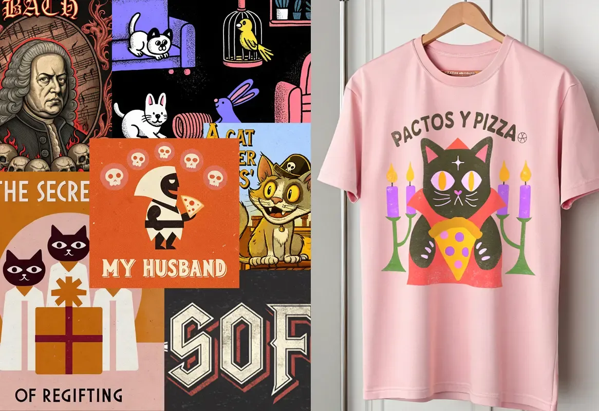
The designs at the top of this article show it well, and in a way that misleads. They look like they are made of four flat colours, and the idea is indeed there, but the grain that gives them that already-printed feel is thousands of tones of noise scattered over the top. The model has learnt to imitate the look of a screen print — the texture, the slightly worn colour, the registration that drifts — without any of it being an ink you can separate. It imitates the result, not the process, and it has to be undone before the result can actually be reproduced.
In screen printing every colour is a screen: its film, its emulsion, its registration and its pull. We go up to six per position, and each one adds work and adds cost. So the first technical decision is always the same: how many inks do we tell this image with.
There are two routes. The first is to reduce it to flat shapes and redraw them, which gives the cleanest print and the one that lasts best. The second is to separate it with a halftone, turning the gradients into dots of a controlled size within a fixed set of inks. For generated images that second route often works well, precisely because they already come with texture built in.
What does not exist is a continuous gradient. A gradient prints as a pattern of dots, and dots have a minimum size below which they either vanish or fill in. Knowing where that limit sits is half the job.
04
Ink coverage: what you cannot see on a screen
This is the part nobody looks at and the one that decides whether the shirt is still liked a year from now. On dark garments every colour needs a white base underneath so it does not go dull. A design that is a solid thirty by forty centimetre square means two full passes of ink.
The result is a plate across the chest: it does not breathe, it is hot, it creases oddly and it is the first thing to crack in the wash. That is not a manufacturing fault, it is physics: you put too much ink in one place.
And generated images almost always come with a full background, because the model does not know you do not want one. A sky, a texture, cinematic lighting. That background is usually the first thing we remove.
And there is a further step that misleads even more: the shirt at the top of this article does not exist. It is a simulation, and there the fabric, the creases and the print are all part of the same image, so the design always falls perfectly flat. A real garment has seams, a collar, a chest that is not a flat surface, and a size S and a size XXL that share one screen. The feel, the weight and how it looks after twenty washes appear in no simulation: that is only settled by putting ink on cloth.
Opening a design up takes more hours than it sounds: cutting the silhouette instead of printing the rectangle, turning large solids into halftone so they breathe, letting the colour of the garment do the work. It looks better, weighs less and lasts longer. All three at once.
05
Details that will not hold on a screen
There is a minimum line weight. Below about eight tenths of a millimetre, between the mesh, the emulsion and how far the ink spreads, a line either disappears or thickens until it closes up. The fine filigree generators sprinkle everywhere is the first thing to go.
Soft edges have the same problem. A blurred edge has to become either a hard edge or a ramp of dots, and somebody has to decide where. Hair, smoke and fur are always the difficult cases.
Generated text is almost never text: it is shapes that resemble letters, with strokes that do not close and impossible spacing. Rebuilding it with real type costs less than trying to repair it, and it also stays legible from a metre away, which is how it will be seen.
And then there are the errors you do not catch on a phone: six fingers, two eyes that do not match, a shoe merging into the floor, a logo that almost spells a word. Scrolling past a photo you miss it. Printed thirty centimetres from someone's chest, there will be a person looking at it for an entire gig.
06
When the honest answer is DTF
Sometimes the image really does need all the colour and all the gradients, and the run is short. In that case setting up six screens to imitate a photograph is expensive and looks worse. We will then tell you to do it in DTF, which prints in full colour and transfers with heat.
The line is roughly this: a few flat colours and a run worth setting up for, screen printing. Photographic image, many colours or few units, DTF. It is not a matter of preference; it is what each machine does best.
We say so because it is the advice we would want to be given: a workshop that sells you six screens for a photograph is not advising you, it is invoicing you.
07
What we do with your file
We check the real size it can be printed at and tell you first, because it conditions everything else. We remove the background and cut the silhouette. We reduce the colours to the number of inks we agreed on and send you a proof of how it will look, not a description.
We redraw whatever will not hold: lines that are too fine, impossible edges, text. We optimise the printed area so the garment stays a garment rather than a board. And we prepare the separated films, which is the file the screen is made from.
When we are done we tell you what we changed and why. Nothing is retouched silently: if we had to remove an element or simplify a face, you will know before anything is printed. And the clean files are yours; if one day you want to go to another workshop, you take them with you.
08
A note on rights
The design has to be one you are allowed to use. Generating an image in someone's style, or a character that looks a lot like a well-known one, does not make it yours, and the person who answers to the rights holder is whoever puts the garment on the market.
That is why we do not print obvious copies of other people's work or trademarks. It is not a moral stance or distrust: we are a registered company that invoices under its own name, and these things end up reaching whoever printed them.
If you have doubts about a specific job, tell us and we will talk it through. There is usually a way to make the same idea that does not depend on anyone else's work.
Numbers worth keeping to hand
- A 1,024 px image
- Covers about 8.7 cm printed at 300 dpi
- Resolution we ask for
- 300 dpi at the final print size
- Inks per position
- Up to 6 in screen printing; DTF is full colour
- Minimum line weight
- Around 0.8 mm so it holds on the mesh
- The square background
- Almost always surplus: the silhouette gets cut out
- Dark garments
- Every colour needs a white base underneath
- Formats that work
- PNG with a transparent background, PDF or SVG if already vector
- When it is DTF
- Photographs, full gradients and short runs
- Minimum order
- 25 units per design
- What you get back
- The clean design and the separated films, yours to keep
Send us the file exactly as it came out
There is no need to touch it first: what gets done along the way often complicates the work rather than saving it. Send us the original image, tell us which garment you want it on and at what size, and we will tell you what can be done, what has to change and what it costs. If you want a rough figure straight away, the configurator gives you one in four steps.